Brand Identity
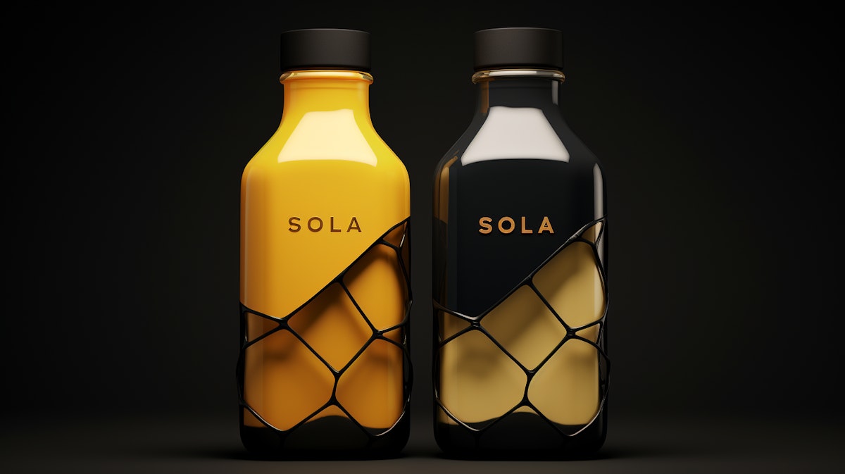
A bold and futuristic identity system created for a tech accelerator. SOLA's branding combines minimal geometry with striking typography to evoke innovation, clarity, and forward momentum.
Overview
SOLA is a brand identity project crafted for a cutting-edge tech accelerator focused on sustainable innovation. The challenge was to design a visual language that feels futuristic yet grounded—capturing the spirit of progress while maintaining a sense of trust and clarity.
Concept
The name SOLA is derived from “solar” and “solace,” representing both energy and calm—two core values of the brand. This duality inspired a design system built on contrast: bold sans-serif typography paired with soft color gradients, and structured grid layouts softened by organic elements.
Logo & Typography
The logo is a minimalist monogram built from a modular grid, evoking circuitry and precision. The type system uses a geometric grotesque for headings and a clean humanist sans for body text, striking a balance between technical and approachable.
Color Palette
SOLA’s palette is inspired by natural light—cool blues and warm golds—to reflect its mission of creating bright, sustainable futures. The use of gradient overlays adds depth and dynamism, hinting at transformation and flow.
Application
From pitch decks to prototype interfaces, the identity system scales with ease across mediums. Subtle motion design enhances the digital presence, while print materials rely on texture and finish to communicate sophistication.
Result
SOLA positions the brand as visionary yet credible—ready to support the next wave of sustainable tech startups with confidence and style.
